Like what you see? Help keep it going! This ad-free site runs on the support of readers like you. Your donation helps cover costs and keeps fresh content coming your way every day. Thank you!
About the cover art of the Undercover album
THE STORY BEHIND THE UNDERCOVER COVER The Rolling Stones’ Undercover cover is pure cheeky chaos. A nude woman strikes a bold, classic stripper pose, red lips and nails popping against a blue backdrop. Vintage vibes, mysterious identity, and dollar-sign S’s in the logo make it unforgettable. Every detail—from her watch to the maroon table—adds quirky flair. It’s provocative, playful, and totally Stones: a wild mix of mystery, style, and attitude that grabs your eyes and doesn’t let go.
One Friday afternoon in 1983 the phone rang. “Hi, is that Bill Smith? This is Mick Jagger.” Art designer, Bill Smith looked around his studio to see who the prankster was. It was no prank. It was Mick Jagger and he liked the work of Bill Smith Studio. Jagger asked Smith to make a meeting the next Monday and he did. Smith discussed ideas about the new album Undercover with Charlie Watts. Smith was asked to come up with some visuals by that Friday for a band meeting in New York City.
Creating the Undercover vision in New York
Smith was met at JFK airport by a white stretch limo that dropped his stuff at the Central Plaza Hotel and then drove on to Jagger’s New York Residence for a meeting with Jagger, Watts, Ronnie Wood, and Bill Wyman. Smith said, “The cover idea they all loved was a montage of each guy’s head with the head of an animal or a bird or a reptile- ‘undercover’- do you see? I think I prepared two really good montages one of Mick and a cheetah and one of Keith and a panther, the other montages were very rough and needed a lot of work still, to make them really look good, but they all seemed to like the initial idea including the inner bag concept which was some amazing Victorian illustrations of different apple varieties…”
Jagger told Smith everyone liked the idea but because Keith Richards was not at the meeting he asked Smith to stay in New York for a few days and complete al the artwork for the album cover and its inner sleeves, while Jagger left New York to celebrate his 40th birthday. Smith stayed on working through the weekend and enjoying the city during his first working stay in New York. The following Monday at the final meeting, which Richards also missed, everyone loved everything. Smith asked if he could return to England to deliver finished artwork to the record company as soon as possible.
Jagger introduced Smith to Jerry Hall as the man designing the new album. Tuesday morning Smith was back in the studio regaling his buddies at the studio with his New York adventures when the phone rang. A manager for the Stones delivered a short message, sorry, Keith does not like the cover, we’re using something else, bye. That was the cover that almost was.
Jagger’s Burroughs-Inspired Spark for Undercover of the Night
The liner notes for the Stones compilation album Jump Back, which was done by Bill Smith, say that Mick Jagger was “heavily influenced by William Burroughs’ “Cities Of The Red Night”, a freewheeling novel about political and sexual repression. It combines a number of different references to what was going down in Argentina and Chile.” This visionary new sci-fi novel was the starting point for Jagger writing the song Undercover of the Nightin Paris around late 1982. The book would inspire both the music and the dance club politics of Undercover of the Night not to mention the controversial video to accompany it. Ultimately, the book influenced the album’s title, which is taken from the song and not for the first time for a Stones album.
Hubert Kretzschmar, photographer and illustrator, said, “As far as I remember Jagger came to the meeting with the title, I knew that there was political unrest in South America around that time, El Salvador, Argentina and Chile. There was no visual concept when I first met with Jagger and he talked about the song Undercover. At that time in 1983 there was a feud between Jagger and Richards, of which I only very much later became aware. They never were in the studio at the same time.”
Undercover of the Night might also describe the manner in which Keith Richards worked on this album. One writer said Jagger recorded between midday and 5 while Richards recorded between midnight and 5 so they could avoid each other. Of that time, Richards says, “It must have been pretty bad for anyone around us who worked in Undercover. A hostile, discordant atmosphere. We were barely talking or communicating and if we were, we were bickering and sniping.” Smith’s album cover may have been a casualty of that feud. The album was released November 7, 1983 in a sleazy blue sleeve that featured a vintage peep-show pinup. Fans were protected from her earthly delights by strategically placed stickers.
The Stones engaged the team of Peter Corriston and Hubert Kretzschmar who had worked successfully for the Stones in preparing the Some Girls and Tattoo You album covers. Corriston designed the covers and Kretzschmar did most of the production work, a relationship they seemed to repeat for Undercover. They are two immensely talented men who do not always see eye-to-eye on each other’s roles. Corriston is a Grammy award winning graphic designer who made his bones by producing Physical Graffiti for Led Zeppelin in 1975.
He also worked with Roy Adzak on the Emotional Rescuecover. He is second only to David Bailey in the number of Stones studio album covers produced with four total. Kretzschmar is a prolific photographer and illustrator from Karlsruhe, Germany. He began his career as a graphic artist and illustrator after studying visual communication and painting at Essen‘s Folkwang Universität Der Künste, under Willy Fleckhaus and Helmut Sundhausen, and with Joseph Beuys in Düsseldorf in 1974. In 1978, he settled in New York, where one of his first jobs was working on Some Girls. He has devoted himself to illustration and pioneering works of photography, video, sculpture and computer graphics.
Some bands come to a designer with a brief, a concept of what they would like to see on the cover. Asked about the brief for Undercover, Corriston said, “The situation is they don’t come at you with anything. You’re working for them as if you are a court painter from the 1600s. They give you nothing, they say, well, if you have something send it to us. I am almost like Goya in the Spanish court trying to paint for the king or the prince.
And that is how it works with these people…so, concepts, they just want to buy concepts, that’s it. So, in terms of the Undercover thing, this was my fourth job for Mr. Jagger and you kinda build a little trust with a person with that situation and so he had this assistant or someone contacted me. Peter, their looking for ideas. And I said what’s going on. They got this single “Undercover of the Night” I think it was a song on there, might have been inspired by Bianca…and then I thought okay let’s uncover something and that is where that evolved.”
Kretzschmar described his process, “Usually I developed a lot of different ideas. There was always a stack of at least 8 to 12 different covers. I consciously included a few ideas I knew that they would get rejected. Peter was an intermediary between me and the band. He was not involved in the creative process. We wanted to give the real contenders a chance to get picked. The selection process sometimes hinged on which member of the band would be present…
…I remember one time, Charlie staggering into a meeting in a drunken stupor and outright dismissing perfectly sound ideas. Basically, killing our presentation with frivolous remarks. And that had of course an effect on Mick making up his mind on which concept I would develop. Most of these concept presentations stayed with Mick and I don’t know if he held on to them or if they got tossed out. There were very elaborate ideas involving cutouts that would allow for myriad variations depending on how the inner sleeve was put back in the cover itself. One concept had each band member paired with a jungle animal and combined in a collage process.” A few apparent alternatives have survived on the Internet as seen above and below.
Corriston said, “And I had done a project with Hubert Kretzschmar in 1980 for a band called Foghat where I used a sticker on the cover. Not on the shrink-wrap but on the cover. So that required a lot of research in terms of the adhesive, is it going to rip off the varnish. Can that sticker come off and go on a kid’s notebook?” And so, the sticker idea was revived.
Kretzschmar picks up the story, “I had worked with stickers in the past, one example was: Foghat’s ‘Tight Shoes’ in 1980. The stickers were to add an interactive layer to the package.” Corriston explained the concept of the stickers this way, “It’s also trying to get through the flatlands. All of us designers want to get through the flatlands, we want to create depth. That’s what that house was for Jimmy Page that I did [Physical Graffiti, Led Zeppelin]. You’re trying to get depth, you’re trying to go in, you’re trying to get off the ground and surface. So, a sticker is something that can come off and go to someplace else that causes interest…And so we showed something to him and I showed him a thumbnail and he liked the idea and I asked Hubert to sketch something up….
…Hubert had this kind of 1950’s soft porn photographs. And he had that photograph so I said let’s just show it to him. And we went up to see Mick at his house in the 80’s on the West Side and Mick, it’s always very difficult, the presentations are always very difficult…we made a presentation of this thing to Mr. Jagger and his response was somewhat minimal, but he was accepting of it. I knew right away from experience that was an approval, but Hubert didn’t, so we just proceeded from there, let’s go, let’s do this. So, that’s how it was done.” They would use the stickers to hide the woman’s lady business.
Kretzschmar fleshes out the story with more details, “It was quite a lengthy process to get to this particular image. I had acquired a collection of stereo 3D slides and a stereo viewer from a used camera equipment dealer in the Chelsea area of Manhattan. As a sample the dealer put a slide in the viewer from this particular collection and it was a nude dancer from the 50’s Times Square area. I acquired all the slides that the dealer had, which were in the hundreds including many rolls of unframed film…
…All I was able to find out about this amateur 3D photo enthusiast was that he liked to take nude stereo slides of these dancers and after he died his sister got rid of all his equipment including these slides. There was no name, no way to find out who he was. I took one of these basic slides and had prints made that exaggerated certain colors (for instance the background in this peculiar turquoise green) I think we spent close to eight thousand dollars in dye transfer prints alone to get that final result and in addition had retouching done.”
When asked if producing the stickered album was difficult, Corriston said, “That produced a lot of difficulty. I had experience with the Foghat job. The manufacturer was outside of Chicago and they were very good at doing these complicated packaging things. What they did they hired people who were mildly handicapped. They were not severely handicapped, they can come in and they can do simple tasks, hand tasks. So, they had a huge room set up with these stickers and these people that were somewhat diminished would put one sticker here and move down the line….They began to get bored and then they started putting stickers on themselves on their foreheads and stuff and the man that owned the place started videotaping it. It was really comic.”
Kretzschmar’s memory about how the album was produced confirms Corriston’s, “…it turned out that it was very expensive to set up a machine that would place a sticker in exactly the Stickers courtesy of Hubert Kretzschmar same spot each time, not to mention seven stickers. So, the printing company ended up using manual labor and hired these women that stuck the stickers in sort of an assembly line onto the printed sleeve. It worked, is all I can say…Besides being an intermediary Peter oversaw the mechanical production…”
Provocative Design and Hidden Details of the Album Cover
The cover features a provocatively posed nude woman leaning slightly back with her pelvis thrust forward in a classic stripper’s pose. With red lips and nails, she stands in front of a wall draped in blue cloth like a curtain, leaning back on a round side table covered in maroon material. She wears a watch on her left forearm and a smile. The photo used for the cover is an old vintage photograph that was in the possession of Kretzschmar, so there is little chance the model’s identity will ever be known. A red font announcing “the Rolling Stones” scrolls the top width of the album. The S’s look like dollar signs.
The woman’s breasts are covered by a rectangularly shaped amaranth and amber sticker that comprises a portrait of Charlie Watts, Ron Wood, Mick Jagger, Keith Richards, and Bill Wyman. The album name appears in amaranth letters written in a Japanese styled font. Her pubic triangle is covered by an equilateral triangle of scaled snake skin. Her left bicep is covered by a square sticker that shows a woman’s right hand spraying a spider in its web with an insecticide called Under Cover. Above and to the right of this sticker is a rectangular one that looks like a multi-colored bookmark. If there is a pattern to this sticker it could not be discerned.
To the left and just above her right hip was another square sticker. This one was a small portable tv. A red tongue logo appeared against a tv background of purple, yellow, blue, orange and green. Diagonal to her right thigh, just above the knee was a second rectangular portrait of the Stones. It is the same portrait that covers her breast but this one features the Stones in something close to a pantone blue against a multi-colored background of byzantine, yellow, white, blue, orange and green. (Someone has discovered Wikipedia’s list of colors page.)
A Stones’ logo appears in a purple circle against the side table. Kretzschmar explained the origins of the stickers, “I was responsible for creating the placement and the content both of the stickers and the images that where underneath. The band went along with my suggestions and I explained that there should be something unexpected when a Courtesy of Hubert Kretzschmar sticker is peeled off to reveal another image. The dog was from an old kitsch postcard (from my collection) that I acquired in Paris…
…The stickers that showed the band were individual photos of the members that I shot, combined into a group and then silkscreen printed on all kinds of papers and materials. There is a piece of a Picasso painting and a Jaguar with a microscopic color background, the anatomy part is a rather random piece of anatomy. I made the TV with tongue logo, the spiderweb with the spray can and the sticker of the naval had the same image underneath. There was also the snakeskin triangle sticker covering her private parts…this idea of using the stickers was supposed to be fun for the consumer or music fan.”
Kretzschmar offered a funny memory, “Another little anecdote was a meeting with Keith where he insisted that I use a different model with bigger breasts and he wanted a sticker shaped like the letter Z covering the breasts, ‘Like the mark of Zorro’ he hinted at me. I actually made that cover for him and ended up showing him that a sticker shaped like a Z would rip if it was taken off”.
The far-right edge of the album reveals a dark blue surface that happens to be a second wall that intersects the blue draped wall. The original photos were presumably taken in a Times Square strip joint. The photo that most male buyers of the album wanted to see is shown below, the model sans stickers and full figured as she appeared in the Undercover calendar.
This time the rear cover really is one. The lower right corner of the album shows a bare bottom bent to suggest the woman is leaning on the round table in another provocative entry position. The artist, Hubert Kretzschmar confirms this suspicion with a photo he made available, shown below. Behind the model is the same blue sheet/curtain. In the upper right corner is a track list handwritten in white. Kretzschmar said, “Yes that is my handwriting. Again, we were in a pinch to get the album out and I suggested to use my handwriting, I wanted to have something irregular (not a clean looking type face) and this is what was used.”
Kretzschmar remembered, “There was a problem with the back cover right before the release and one big chain outlet, I forgot the name, refused to put the album in its bins because of the visible female behind. So, Jagger had me design a tongue logo as a sticker to put on the shrink wrap, which was done to clear that hurdle.” An alternative photograph, provided by Hubert Kretzschmar appears below.
Beneath the breast-hiding Stones portrait was a picture of a white French Poodle. The triangle sticker, once removed, reveals a drawing of the inside of a human body that looks to be anatomically correct for its placement. The insecticide sticker when removed reveals part of a city’s high-rise buildings at night. The TV is replaced with the right eye of a colorful Picasso painting (Woman in a Hat 1962). The second Stones portrait remains in place in the same pantone blue, albeit with a monochromatic amber background. The logo has been replaced by a cheetah profile. The ‘bookmark’ top right remains the same.
Inner Sleeve Kretzschmar explains the origins of the inner sleeve, “We were in a pinch to finish the album package and I just had received a Japanese magazine called Illustration which had this illustration of the apple, I forgot the artist’s name. We acquired the rights and used it on one side of the inner sleeve.
No deep thoughts here, it had a certain symbolic value “Adam and Eve paradise Apple” we just went with our gut feeling.” There was an insert that contained lyrics on one side while the other side provided a view of the album cover with the stickers removed.
It is quite likely that Smith’s Victorian apple illustration idea was recycled by someone familiar with Smith’s earlier work. Corriston described it as a hyper realistic illustration of an apple taken from a Japanese illustration guide. It shows a fruit-bearing cutting from an apple tree that supports two apples, nine leaves and two sprigs. It seems to have been chosen for its ability to disorient the viewer and to take you to a different place than the cover does.
Corriston explains it this way, “There is no story behind it except for this aspect of triangulation…You look at the front you look at the back you look at the inside and it does exactly what you’re saying, the apple had some significance. It kind of spins you. You really don’t know what is this about.”
The flipside appears as if it could be a rumpled red bed sheet. It is evocative of the background used for the famous Marilyn Monroe pin-up that appeared in the first edition of Playboy magazine. Asked about this, Kretzschmar explained, “No, I took that photo of the fabric, I liked the color red with the color of the outside, but you are right it has something of the MM vibe.”
How a Teenage Fanzine Led to the Official Stones Fan Club
In 1972, Brooklyn-born Bill German heard a Stones song wafting from his sister’s room and it changed his life. By September 1978, German, a junior in high school, produced his first fanzine. In his own words, “I dubbed my ‘zine Beggars Banquet because I wanted it to be—bear with me on this— “a banquet of Stones information that even a beggar could afford.” The Stones discovered, read and liked German’s fanzine and before long he was befriended by Mick, Keith and Ronnie. Fast forward to 1983, when the Stones directed Gordon Bennett to set up an official Rolling Stones fan club-better late than never, right?
Jagger and Richards insisted Bennett get German involved; they wanted the unbridled enthusiasm of a true Stones fan. Bennett told German, “Your newsletter will be advertised in the next Stones album (Undercover). It will be declared the official Stones newsletter, and thousands of fans around the world will receive it. We’ll provide you with a new masthead that will incorporate the Stones’ tongue logo. We’ll pay you a salary per issue, and we’ll pay your expenses, including all printing costs and photographers’ fees. Plus, you’ll receive full cooperation from the band and their employees.”
Bennett asked if German needed anything for the first official issue. German wisecracked, “Yeah, how about interviews with Mick and Keith?” “Consider it done,” he said. The UK insert is seen below. A mock cover of Beggars Banquet dominates the top half of the insert, which urges fans to subscribe to the bi-monthly newsletter and promised interviews, Q&A, quizzes, photos, letters to the editor, a collector’s kit and more. The bottom half of the insert comprises a photo showing some of the contents of the collector’s kit and an oddly shaped cut-out subscription application.
The collector’s kit included a record with an interview of the Stones on it, post cards, a button and sticker, and 25 items in all. For £7.99 in the UK and £8.99 outside it, one got a year subscription (6 issues) to Beggars Banquet, a one-year membership in the fan club, and the collector’s kit. Just a subscription to the newsletter cost £5.50 in the UK and £6.50 outside it. This event made Circus magazine’s headline.
Columnist Lisa Robinson wrote, “Little Stones fanzine becomes official…German has sources … that surprise even the members of the band…As a result, Beggars Banquet is now the official Rolling Stones fan club newsletter…. German’s little fanzine has become a real success story.” In the states, Detroit Free Press columnist Gary Graff wrote, “The Stones have bought out Bill German, a Stones freak who has been independently publishing a fan magazine titled Beggars Banquet. The Stones are now bankrolling it, claiming to be giving German free editorial control. We’ll see whose side time is on with this one.”
Twenty thousand joined the fan club in the US and received a letter from Bill Wyman, the ceremonial president of the fan club. “Welcome to the Rolling Stones Fan Club,” it said. “Although we have never had an official fan club in the United States before now, we were aware that a young man named Bill German had been publishing an unofficial Rolling Stones fan magazine called Beggars Banquet for the past five years. We felt that one of the most important aspects of a fan club would be to allow the members to receive exclusive regular updates on our activities, and so we asked Bill if he would like to write and edit our official fan club magazine. Bill accepted our invitation, and we are pleased to announce that Beggars Banquet is now the official Rolling Stones Fan Club magazine.”
For the posters, Kretzschmar used the cover as a guide and photographed Liza Cruz, the girlfriend of his musician friend, Thomas Trask, who was in the band of Helen Schneider with the Kick. Kretzschmar had a set built to match the look and feel of the album cover. The pictures where used for full page advertisements and a poster.
Controversy Strikes with the Undercover of the Night Video
It’s a Stones album, there had to be a controversy, right? Feminists were contemptuous of sexual domination, bondage and pain themes found in multiple songs. But this time the controversy was over the Undercover of the Night video created to accompany the album. The MTV era was dawning and the Stones now had videos to produce along with their albums and tours. Julien Temple was hired to produce three videos. Shocking images were the stock and trade of his videos. Undercover of the Night was made in Mexico City, a stand-in for El Salvador. Jagger plays a detective who is helping a woman (played by actress Elpidia Carrillo) whose boyfriend, also played by Jagger, is kidnapped by a band of kidnappers lead by Richards.
The detective and the woman follow the kidnappers, witness an execution style slaying, apparently survive a shoot-out in a church only to tragically learn later that Detective Jagger was mortally wounded in the church by one Mr. Richards. Art imitating secret wish? Enter the controversy. The video was too violent for MTV. The BBC refused to air it. The uncensored video can be seen here. A heavily re-edited version is found here. For a tedious interview that attempts to encapsulate the controversy see here.
She Was Hot the second video features Anita Morris as the love/sex interest in this video found here. Too Much Blood was the third Temple video. Richards and Wood chase after Jagger with chainsaws while a frightened young woman deals with faucets that run blood as well as a telephone, tv, and electrical outlet that bleed. It is found here. In total, the three videos raise the question; how did we survive the 80’s?
Undercover marked the end of a very productive collaboration on Rolling Stones album covers for the talented team of Corriston-Kretzschmar. They gave us Some Girls, Tattoo You and Undercover, three memorable covers in five years.
Like what you see? Help keep it going! This site runs on the support of readers like you. Your donation helps cover costs and keeps fresh Rolling Stones content coming your way every day. Thank you!


")


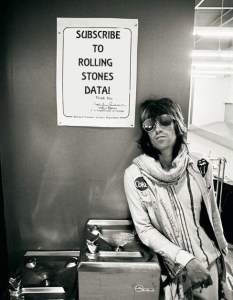
 Stones Data on Substack